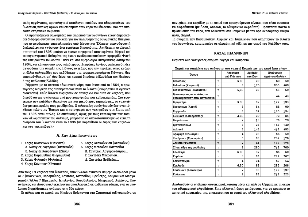
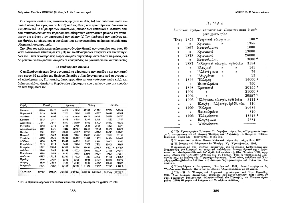
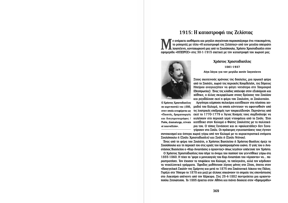
Reading Note 1
The book establishes its reading contract early: images and text are deliberately placed in close proximity, forming a parallel narrative structure. While often referring to the same subjects, neither layer is treated as subordinate or merely illustrative, allowing meaning to emerge through their relationship rather than direct explanation.
Reading Note 2
Archival documents enter the book as primary evidence rather than visual supplements. Layout decisions remain deliberately restrained to preserve authority, legibility, and historical weight.
Reading Note 3
Off-flow inserts function as pauses rather than transitions. Poetry and non-narrative material are placed outside the main sequence to suspend, not advance, the documentary flow.
Reading Note 4
Domestic space is introduced as a narrative framework rather than a subject. The layout prioritizes continuity of reading over visual emphasis, allowing individual stories to emerge without isolation.
Reading Note 5
Here, density becomes a structural tool. Multiple images and extended captions are deliberately compressed to reflect the collective nature of memory rather than individual moments.
Reading Note 6
Objects are treated as carriers of use and memory, not as isolated exhibits. Scale and placement preserve their everyday presence rather than aesthetic autonomy.
Reading Note 7
Testimony is presented through a dialogic text structure, distinct from the book’s narrative voice. Archival material is placed in parallel as corroborating evidence, reinforcing the spoken account without interrupting its flow.
Reading Note 8
Quoted texts by other authors are set with increased left and right indentation to clearly distinguish external voices from the book’s narrative flow. This typographic shift allows extended quotations to remain legible while preserving the continuity of the surrounding text.
Reading Note 9
Hunting is presented as a repetitive collective practice rather than a singular event. The layout emphasizes continuity, bodily proximity, and accumulation, allowing images and captions to function as records of participation rather than spectacle.
Reading Note 10
Festivity is approached as a social institution rather than a visual event. Documents, group photographs, and textual narration are placed on equal footing to avoid spectacle.
Reading Note 11
Typographic differentiation is used to facilitate the reading of the timeline, allowing chronological information to remain clear and navigable without interrupting the surrounding narrative.
Publication identity and circulation material
- Cover (full spread)
The cover combines an aerial photograph of the landscape with a hand-painted depiction of the village, connecting physical place with lived memory.

- Poster (A4)
The poster presents the book in a public, informational format, retaining the same typographic structure while adjusting scale and density.

- Bookmark (double-sided)
A double-sided bookmark designed to accompany the reading of the book, using the same typographic language at a smaller scale.

- Presentation banner
Banner used during public presentations, applying the book’s visual identity to a large-scale setting while keeping information clear and readable from a distance.
Βook Design as Cultural Documentation

Φωτεινό [Ζελίστα] — Editorial System for a Living Archive

Fotino [Zelista] — My Village is an extensive editorial project of cultural documentation, produced under the auspices of the Brotherhood of Fotino (Ioannina). It is built upon primary photographic material, oral testimonies, poetry, archival documents, and objects of everyday life.

The book’s design does not treat imagery as an illustration of text, but as an equal narrative layer. Photography, written word, silence, and archival fragments coexist within a continuous flow, structured through a rigorous yet flexible editorial system—designed to sustain a large volume of heterogeneous content without compromising readability, rhythm, or emotional precision.

The editorial structure allows memory to unfold gradually. Dense and sparse spreads, parallel narratives, off-flow inserts, and shifts in pacing form a cohesive body of work exceeding 500 pages. Each layout decision functions as a tool of organization rather than embellishment.

This presentation does not attempt to condense the book. Instead, it maps its internal logic: how content is sequenced, how images are managed across varying densities, and how typography and layout mediate between documentation and lived experience.

Here, design operates as an act of stewardship. Its role is to hold, organize, and give space to collective memory—without aestheticizing it into nostalgia or reducing it to spectacle.

Cart (0 items)
UP
Select the fields to be shown. Others will be hidden. Drag and drop to rearrange the order.
  • Image
  • SKU
  • Rating
  • Price
  • Stock
  • Availability
  • Add to cart
  • Description
  • Content
  • Weight
  • Dimensions
  • Additional information
Click outside to hide the comparison bar
Compare